Here's the July 27th Ad for the Ad This Challenge. The twist is all about the title. Using a combo of fonts, stamps and embellishments to make up your title and let the title tell the story of your photos.
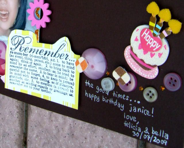
 Here's my take.. I love how the title is the main focus on the ad. I was inspired by the fonts in the ad and how the different elements form a composition... I tried re-creating it on my layout.
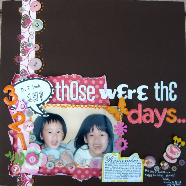 Using various fonts to form the title...
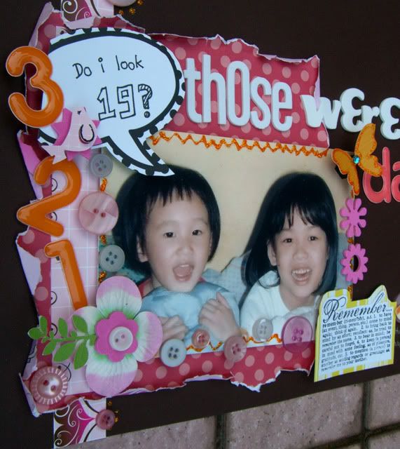
 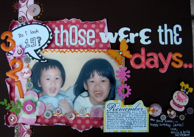 Also used some Papierhouse stash i received to frame the photo...





3 comments:
great lo
kove the colors
Great use of letters, love the colors :)
Love the alpha mix and the colours. Thnaks for playing with us at Ad this.
Post a Comment